 I am home sick today.
 Which means that I only have one assignment - an afternoon sports portrait.
So I am taking advantage of my nose-running, house-bound status to catch up on some admin. I'm burning assignment CD's, gathering mileage/receipts, backing up the hard drive, etc.
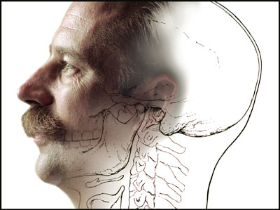
While backing up my hard drive, I came across some old photos from my pre-Baltimore Sun days. The one at top is a circa mid-90's quickie illustration of a medical illustrator named Tim Phelps.
I was assigned to do an office portrait of Phelps for a cover story on him. Which meant that I would likely have to make something boring into something interesting with some light. Office portraits can usually been improved from "nothing" to "something" with a little light.
So, I am shooting this guy at his desk. Even with decent light, the photo was a yawner. Then I see a drawing he had done of a profile of a human skull.
As someone who was just learning Photoshop at the time even I realized that the two could be combined for a cool illustration.
And before you get started, yes, I know my PS skills were pretty darn rudimentary at the time. But gimme credit for the idea.
The point here is that off-camera light can give you the flexibility to try something new. Or to develop an idea that works within tight composition constraints.
In my case the drawing was obviously going to drive the composition of the illustration, and thus the photograph. So I shot him in profile with a white wall for a backdrop.
The light was coming from camera left, slightly behind his face, into an umbrella. The one light illuminated both Phelps and the wall.
I used a Nikon SB-24 on 1/4 power manual. It was positioned just behind Phelps to give nice modeling on the camera-side ear, eye and cheeks. Lighting from slightly behind is usually better than lighting from straight-on profile for this reason.
Once I had a nice profile shot of him, I used the same flash as a copy light to shoot the drawing.
Then it was an easy matter to (badly) combine the two in Photoshop back at the office. (Hey, I was new at this.)
For you ethics hounds: Yes, it ran with a "Photo Illustration" credit line. And it is pretty obvious this is not a straight portrait.
The office portrait was moved from the cover to the inside lead, where it could be horizontal and carry more information than if it were a vertical cover shot with room for type.
I rounded it out with some copy shots of his illustrations, most of which were far more detailed and realistic than the skull drawing seen above. (This guy was good.)
In each case, the ability to get one cheap, small light off camera made a huge difference in the quality of the various photos in the package.
Which is an important point. Much of the time, lighting well does not yield a home run. It turns strikeouts into singles, and singles into doubles or triples.
This tends to raise your minimum standards. And that allows you to swing for the fences more often on your daily assignments.
Next: Fourth and Long? Punt With a Plant


0 comments:
Post a Comment