To this point, we have worked our way through several different areas of photography, and I hope you are starting to get a sense of how some of these different assignments fit into a common thread.
First, with the Headshot assignment, you started with a very limited subject. The goal was to get it clean, simple and elegant. We moved on to a couple of different environmental portrait themes, first concentrating on physical surroundings and, next, aiming to create a specific connotation.
The water assignment, couched as a "break," was designed to show you what you could do with the simplest of subjects and a craftsperson's approach to composition, lighting and design.
With the current assignment, we took that same idea and increased the scale. Since you are not all sporting 10,000 watt-seconds of strobe, you had to pay careful attention to the ambient and learn to work with it.
The final assignment will allow you to learn all of the skills you have explored up to this point.
But first, let's get this penultimate assignment wrapped up.
View With a Room was an exercise in composition, design, camera angle management and learning to "go with the flow" on light - while helping it out a little, of course.
For me, it was a chance to peek inside many of your houses. (Looking at my house and some of really cool places you guys live in, I have decided that somewhere along the line I must have chosen the wrong profession...)
As usual, click on the pic for the Flickr page, where most of you have posted lighting info. And the others will be posted shortly. (Hint, hint.)
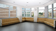 Leading off, we have a simple composition that was probably a little harder than it looks to light. You can't go too far into that ceiling from the camera angle with light before you start to ruin it by blowing the ceiling out.
Most of you did a very good job of balancing the ambient in windows, too. The secret to getting it to look natural (as many of you apparently found out) was to leave it a little hot, but not blown out.
Either you are starting to think pretty well, or your flashes weren't powerful enough to finish the job.
I'll give you credit for the former.
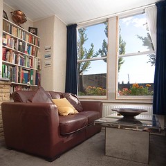 The photographer responsible for this little corner shot did not give himself enough credit. It's nicely done, and the accent light behind the bowl on the table is just the kind of thing you can do with a small flash to add a finishing touch to a picture.
Perfect? No. Stunning. No.
More "quiet," I would say. but this would make a nice secondary photo in an architectural spread.
Room details are just as important in this genre as in other areas of photography. Give the designer choices like this to go with your lead shots, and you will get more photos run.
 There are a lot of cool (uh, warm, actually) layers of composition and light in this shot from Japan. A composition with a very Japanese feel, if you will.
I love the way the window square of light on the left wall echos the color of the floor lamp.
And the sheer window in the back is brought up to just the right level. Wispy, but not screaming.
Nicely done.
 Having done a few rooms like this one, I can tell you what a pain-in-the-butt job balancing all of those displays can be.
This was a well-executed job.
Using the strobe not to nuke the room but to subtly call attention to the gear rack on the left was elegant thinking.
 I would be remiss if I did not spotlight this bathroom shot.
 It transcends the room genre into that of a still life. It looks like it was shot on 4x5, with its crisp lines and detail. Maybe with a huge, expensive soft box over to the left.
Only this shooter did it the Strobist way, actually making part of the bathroom into a soft box. Good thinking, for sticking a small flash in the shower and shooting through a white shower curtain.
And, finally, this gem from an amateur in Spain.
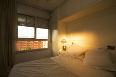 Less is more in this beautiful, hauntingly simple photo of a bedroom.
Note the leading lines that draw your attention to the center of interest: a lamp augmented by a snooted, CTO'd flash.
This is so spare and elegant, it could easily be one of those sense-of-place photos that runs across two pages in the New York Times magazine.
The fact that the bed is not neatly made adds to the story. Or highlights the photographer's laziness. Not sure. But I like it.
The sheets, being white, we dropped down a couple of stops to have plenty of detail, but enhance the mood.
Very, very nice photo.
And good job to all. I am off to Florida for what I hope will be a successful NFL season opener.
Continue discussion on View With a Room here.
Last of all, Moishe from Midwest Photo Exchange (who is sponsoring this Boot Camp) e-mailed me to say that he scored a big load of the compact, 5-section stands. So strike while the iron is hot by phone, e-mail or web if you have not been able to get one yet.


0 comments:
Post a Comment