 Okay, the polls are closed and the votes are in. It was fun to watch you guys try to reverse engineer a photo which was lit in a very not-very-obvious way.
Several of you got it pretty close. And if you didn't, no worries. First, this was not an easy photo to reverse. And second, the final look was a little nebulous and could probably have been achieved through any one of several different techniques.
This photo was very much a figure-it-out-as-you-go kind of process. We played with the setup until we got a look that we liked.
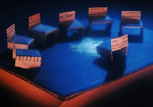
I say "we" because this photo was very much a collaborative effort between the designer and myself. She was the one who came up with the concept of shooting origami chairs on a book, and it was my job to light and execute her idea.
This is the best of all worlds, IMO, as she brought a good concept to the table with enough flexibility still left in the process to further improve the result.
So, here's what we did. Click on any photo to see it bigger and/or comment.
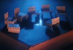
 I decided my goal for the lighting was to connote a winter's night with a semicircle of readers near a fireplace. So, the first step was to position the pieces and set up the backlight, which would provide the mood.
 In the photo above, the only light for the scene is an SB-26 into an umbrella behind the book. This gives a soft, three-dimensional feel to the scene.
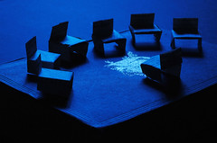 Next, I gelled the light with a moderately blue gel (1/2 CTB) for mood. This was less blue than I needed, so I also set the camera's white balance to tungsten to enhance the blue color.
Normally, I prefer more subtlety. But newspapers are not known for their prowess in reproducing a saturated blue. So sometimes you have to hit that color over the head with a hammer.
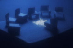 Next, the Zip-lock baggie. We placed that over the lens, as a couple of you guessed. Easy diffusion.
 We actually doubled it up for more softness, but the combination of the soft (umbrella'd) light and the baggie made it too diffuse for my liking.
 To solve this, I swapped the backlight to a bare flash to make it harder.
 I felt that this would give me a better looking diffusion edge when I shot it through the baggie.
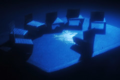 Playing with the location of the hard backlight (so as not to cover the crest in shadow) and various levels of baggie diffusion gave me this result, which I liked.
 Now, it was time to create the frontal light.
 I did this by light painting over a 30-second exposure. My continuous light was an SB-800 flash, using the modeling light button to create daylight-balanced continuous light in 1-second bursts.
 You could easily use a flashlight for this, too. In fact, I think a flashlight might have worked better.
Since I was shooting at tungsten balance, the light would be blue. To make it neutral, I gelled it with a CTO. To warm it up past neutral, I stuck on a second CTO. You can stack them this way for more effect.
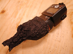
The snoot on the front was quickly made with Rosco Cinefoil, which is basically black aluminum foil. This gave me a light beam about two inches wide at a distance of two feet.
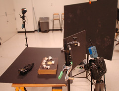 Here's the setup. The shot was done in almost total darkness. You can see the background flash in the back at upper left. The big black gobo is to block as much of remaining shaded window light as possible.
 The card in the front of the camera is to gobo the background flash to control flare.
To complete the shot the following sequence was used:
1. Lights out.
2. Place baggie in front of lens. (It helped having a second set of hands here.)
3. Fire the blue flash with the start of the 30-sec exposure.
4. Immediately remove the baggie.
5. "Light paint" (using the double-CTO'd, snooted SB-800 flash on modeling light function) on the sides of the chairs facing the camera and the top front edges of the book.
6. Repeat over and over until you get one that you like.
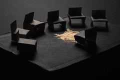
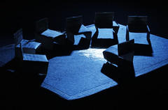
 Here is an alternate choice to the original pick. I actually liked this one better in RGB form, but the more saturated photo looked similar to this in tone by the time our presses got done with it.
Also, we nixed this shot because the shadow fell on the crest, which was distracting.
You can see why this photo is so hard to reverse engineer. The back light is hard, yet diffused - and blue. The front light is sharp, very warm and coming from multiple areas at once. I like this overall effect because it has three simultaneous forms of lighting tension: Front/back, hard/soft and cool/warm.
If you are not thinking "light painting" the front light is almost impossible to solve. It is low-angled, yet the front chair does not shadow the back chair. It seemingly has to come from the left and and right, because that is what it does at various times in the painting process.
Look around the chairs closely in a big version of the final choice and you can see some neat things happening in there along the edges where the soft and hard light overlap.
Also, I love that the designer folded the chairs in a way as to be able to read snippets of titles on the vertical sections and neat little sentence fragments on the leading edges of some of the chairs. Those details make the photo.
I really enjoy shooting this type of a concept photo, as the success is always going to hinge on execution. I hope to do a lot more of this kind of work at The Sun.
Next: Lighting a Large Interior


0 comments:
Post a Comment