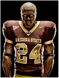
 Phoenix-based shooter Blair Bunting must have been asleep the day they taught the classic portrait lighting styles in school. Either that, or he skipped right past "Rembrandt" and went straight to "Badass."
Bunting is part of a movement of a high-def lighting style that is especially well-suited to subjects like athletes, rock musicians, MMA fighters, assassins, orcs, etc.
Keep reading for full lighting diagrams (hint: lots of sources) and some Q&A on Bunting's techniques and lighting philosophy.
________
The first thing to consider when sculpting light like this is to leave some shadow. The light's edge is defined by shadow, which is what creates the form. The other thing to remember is that the intensity of the surface of the subject also is revealed by specular highlights. And each light source is going to create a specular of some kind.
Placing lights where you want them -- and keeping them away from where you do not -- is the balance you need to strike to make this kind of photo.
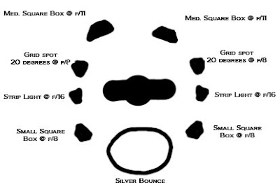
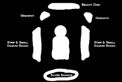
To get an idea of what it took to create this look for a portrait of Arizona State running back Keegan Herring, check out the top-view and front-view lighting diagrams, below.
Top View

Looking at this angle, you can see that Herring is lit from just about everywhere except the lens axis. This is what makes the lights define him in such a cool way. Again, you have to leave shadow to get form.
But each of those lights his the subject on a glancing blow, with respect to the lens axis, and that is what creates the cool highlights.
Lotta lights? Yeah. It's pretty much walking into a camera store and asking for two of everything they have. But it is a look. And it's a look that will make a college sports information department do the Happy Dance and call you back year after year. Just like they do for Bunting.
Front View

To look at the top view, you'd think Herring is inside of a cylinder of light, but that does not take into account the varying heights of the light sources, which in this way creates yet more sculpting with shadows.
From this angle, you should really start to see the light coming together.
Height-wise, the strips and small square boxes are doing the heavy lifting, lighting the body and face. But it is the beauty dish (don't call it that in front of Herring) grids and reflector that create the edge everywhere.
"Yeah, yeah," you say. "It's really all done in post. Ten minutes of shooting and two days of Photoshop."
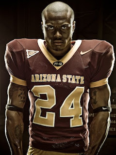
 Yeah, well, maybe not so much as you think. In fact, Blair was kind enough to release a raw photo, seen at left, which shows you just how close he gets with light.
From there, it's pretty quick and basic in Photoshop. It always helps to start with the best file possible. And the closer you can get in the camera, they better. That said, Bunting notes that he tends to think of light as expression, rather than as a process. He said he uses light to create opinion and emotion.
He gets the "what light is best?" question a lot, to which he responds:
"Buy what you can afford. The reasoning behind my answer is that I am of firm belief that practice is more significant than any brand name. I have been fortunate enough to use numerous different brands of lights, hot and cold, small and large."
As for tools vs. vision, he says, "I fall into a rhythm where my tools give way to my vision and my eye produces what my mind wants to see. Be it Profotos, Alien Bees, or SB-800's, one can create with all of these."
He particularly worries for the beginning photographer who finds his or her approach inferior to a photographer using more expensive lights. He feels that mindset is a dangerous mental handicap, and wishes it on no one.
Where does he get his inspiration? You might be surprised:
"Often times I find that the music I listen to can determine my lighting approach more than anything else. With my eyes closed, a glass of wine, and a powerful score (or any song that drives you within for that matter) I sit and think of light not as this invisible substance, but a tangible entity."
He goes on:
"Mentally I observe it like wind and smoke and try to imagine how it should form my subject. This is particularly practical when shooting cars as many people hit a road block with the reflectivity of metal."
Bunting also thinks of light as water, using analogies of hard vs. soft, narrow vs. wide beams and hot vs. cold. It's an organic way of describing light that I had never considered, but it has me thinking.
He advises photographers to consider, and learn, the power of a single light source. Know what a single, silver umbrella can do for your subject, and to respect light.
Lest this all get too philosophical, I hit him up with some specific questions:
Q and A
1. The lighting design for the football player is killer. How did you evolve this particular lighting style? Were you influenced by video games? Movies? Other shooters?
Oddly enough, this one was music and visualizing for endless hours. I lived with my Ipod in and would skip lunches to plan (this shoot had 10 shots to be done in 2 hours). For this one in particular I listened to everything from the Gladiator theme (“The Battle” by Hans Zimmer) to death metal.
The idea was to make the scariest person imaginable. So the lighting was based off of discomfort, a lot of lights, a lot of speculars, a lot of chaos. The idea of the lighting came from the countless movies where you can barely see the person, rather an outline; in this case I wanted it carried a bit further with his eyes.
2. Do you find you get hired to do a certain look? Do you feel you still have creative freedom?
I have been especially fortunate in this area. It is often that I get booked by clients that have someone of a concept and want my style to carry it, which in turn lends a great deal of creative freedom my way. Other times I will be booked by a client that maybe wants a less moody image, but still wants my view brought into the shot, either way the freedom is there.
The downside is sometimes all I want to do is think about lighting and would give anything for a set in stone storyboard where I came in, followed directions, lit, shot and went home.
3. That's, um, a lot of light sources. Typically a shooter would not start out with an arsenal like that. What kind of approach were you using when you had fewer lights?
I am a huge fan of shooting one source, and often have usually with one silver umbrella. Another way I saw lighting (when using fewer sources) was making sure that the eye saw a comfortable single direction in the photo, and from there countering that source with a fill to keep the contrast ratio down.
4. Given that many watt-second deployed against a single player, how do you adapt that look to larger subjects -- say, an offensive line?
This is sometimes a task, in all honesty. The football player need a lot of light since the shot was done with a digital medium format system, which requires more than a 35mm.
I will usually try and bring larger packs (preference going to the Profoto D4 4800). However, there are just times when there are not enough lights and the budget isn’t open enough to bring in 20 or 30 heads. (DH note: 20 or 30?!?) In this case I improvise and try to visualize the scene with a single light source and take small steps building off that to a minimalist approach.
5. Is heavy post production an important part of this look? If so, how close do you get with the light and how much needs to be done in post?
In all reality I am not that savvy with Photoshop. Because of this lighting has to be perfect. I have seen guys take snapshots of cars and make them look like a studio shot. I respect this approach, but it’s just not mine and is dangerous if an AD is on set and wants to visualize a shot for placement. Much of the work I do looks extremely close to what is seen in the LCD on set with added contrast, polishing and sharpening. I have included the jpeg for the football player shot for reference as a file that has not seen Photoshop.
____________
Blair posted a brief video vignette from other parts of this same shoot to YouTube:
Thanks much to Blair for giving us an inside look at both his lighting techniques and philosophy. To see more of Blair's work -- or to hire him -- visit his website.


0 comments:
Post a Comment